Picture
Swedish-born Linn Olofsdotter has not only moved around the world, she’s also shifted her career from graphic design to motion graphics, before working as a senior art director at a Boston advertising agency. Currently Olofsdotter works independently creating artwork for a number of clients — including Levis and Spin Magazine — in the fashion, advertising and editorial fields.

 
Picture
http://www.robertbradford.co.uk/3d+plastic/

This lost at e minor blog (www.lostateminor.com/catergory/art/) I have signed up for is really good and I urge everyone to take a look!!  I cant believe how many fab and interesting artists there are out there!!!!  Its not just artists, its whatever is happening in the world of culture and interest.... Take a look!!
 
www.littlecircusdesign.com

 
This is a fab site that keeps updating with interesting new things, I have just come across it and subscribed... looking forward to learning new things

http://www.lostateminor.com/category/art/

http://www.thecolour.com.au/
Picture
 
OMG!!!!!! OK IM actually wetting myself with excitement!!  This guy is AMAZING!!!! This is how I picture my work in my head but am not anywhere near good enough to physically produce it!!!!  www.rexray.com Enjoy!! x
 
Picture
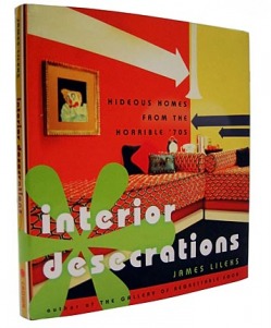
AAwwwwww I REALLY want this book!!!

Ugly is as ugly was: The horrors of 1970s design February 02, 2005|By Annie Groer, Washington Post Among this year's crop of coffee-table tomes -- celebrating four centuries of French armoires or the sun-drenched colors of Santa Fe style -- scurries a most welcome garden-party skunk.

The book "Interior Desecrations: Hideous Homes From the Horrible '70s" is a full-throated rant against the decade of shiny op-art wallpaper plaid upholstery and long-haired rugs in a palette dominated by orange green and brown everywhere brown.

For 176 pages most featuring eye-jangling photos in full color that actually appeared in well-regarded design magazines of the era author James Lileks ridicules an aesthetic he lived through and loathes. In prose by turns vulgar blasphemous and hilarious he takes no decorating prisoners.


From deep within a 1915 Arts and Crafts home the author describes as extremely tasteful and entirely kitsch-free the Minneapolis Star Tribune humorist wrote the following about '70s interiors: "This is what happens when Dad drinks Mom floats in a Valium haze the kids slump down to the den with the bong and the decorator has such a desperate coke habit he simply must convince half the town to put up reflective wall paper. ..."

It seemed so normal at the time that Lileks said his own tasteful unmedicated mother
performed a "fashion upgrade" on the living room of the family rambler in Fargo N.D. even as young James now 46 sat around in bell- bottoms and Earth Shoes watching "Hee Haw."

The shag carpet he lamented during a recent phone interview was "an unusual brown where if you ran your hand through it it turned a light brown. A sofa was added characterized by an unusually florid design that made the rococo period look like Mondrian. It was beige white black brown orange and cream with flowers that would have come to God in a fever dream. As though we understood there was something wrong about it the pattern was instantly covered with thick translucent plastic to protect it."

Very little in the book (Crown Publishers $23.95) is protected which is too bad. Sunglasses or blinders would have helped in viewing rooms he captioned as "the visual equivalent of granulated glass in your eyes."

Lileks starts at the front door. One entrance hallway is a symphony of black-and-white busy-print wallpaper and checkerboard floor tiles and it segues into an adjoining chamber covered in brown yellow black and white stripes and dots. Another foyer boasts a curved stairway with vertical abstract printed paper he likens to "a close-up of one's intestinal lining.... You can be sure the designer chose this scheme because it 'drew the eye upward. ' Of course one could say the same thing about the Hindenburg disaster."


Brilliant!!!
 
http://worldofkitsch.posterous.com/?tag=uglyart

Haaaaaaa!! on delving further into this lady's blog I like her even more!...she truly 'gets' the love of ugly and has a home to be proud of!!!  Here i would like to give a special mention to my lovely friend Neet.... when we first moved into our new 'family' home we started to try to blend our fab previous house that was our cool funky party house filled with ace stuff (in our opinion Neet!!) with our new child friendly family home!!!  We had just started decorating the 'family' room and had started adorning the chinmey wall with our fab orange and brown seventies wallpaper.  Neet was our new next door neighbour and came for a look around.  She stood in front of our half papered wall and said in a very calm and measured voice...."hmmm its looking nice in here...ermmm is that going up..or coming down?????????????????!!!!!!!!!!!" Haa! Love ya Neet! but would you ever need to ask me that question now you know me??!!
 
http://www.csaimages.com/galleries.asp

ok, so my mooch hunt of the week is ugly, kitsch and all things tacky gaudy and frameable!!!

I am currently finishing off my grown up room - no munchlings allowed (hmmmmmm).  Chocolate walls, dark red leather chesterfield and the finishing touches have drifted in over the past few weeks.... the ugly gilt frames, the handmade (by me courtesy of my lovely students cast offs bits of glass!) glass chandelier, my HUGE abstract painting and the piece de resistance..... the most god awful ugly resin mooses head my lovely husband lugged all the way back from Canada for lil ole me!!!!!  My reason for the kitsch mooch this evening is that my 5 ugly gilt frames need filling!!  links to follow as i cant lose any precious link for the future!!! xx
Picture